From looking around at these wonderfully designed business cards you’ll probably think “where do the designers get all those great ideas for their business cards?”
Aside from their natural talent and years of expertise for designing, these people get their amazing ideas for their cards from inspiration and hopefully from the tips I’ll be giving in this article.
First of all, you’re not going to just snap your fingers for the idea to come to you. Like all works of genius, thinking of a beautiful and substantial design for a business card will take some thinking sessions and brainstorming.
If you are designing a business card for yourself it will be much easier because making business cards is all about summing up who you are and condensing it all into one 2×4 size paper and hope the message will get across to the person who you give it to.
Business cards are like zodiac signs; they’re like animal symbols for what you are so that when you hand out your business card to a person they’ll be able to think right away that ‘oh you’re a Taurus, you must be a very determined person.’ In essence they’ll form a fundamental idea, a gist of who you are or what your company is all about.
If you are designing a business card for someone else, make sure to know the person or the company well enough to be able to effectively come up with a design for them. The same rule will apply with thinking of a business card concept or design for someone else—you’ll have to get what the person or the company is all about and then interpret it into a design.
Now that you know the basic idea of what a business card should be about, here are several tips on how to make a great business card:
- Visible contact details. Make sure you incorporate your name, email, website fax or phone number (whichever of these you might have) in your business card. Your design should be substantial — it should be attractive enough to catch the eye of people and remain in their memory, but the basics of how to contact you should be present!
- On design itself, try to think outside of the box:
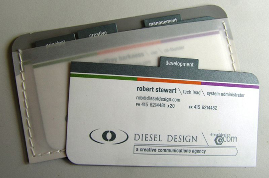
- Think of different shapes you can have your business card in. You can draw inspiration from what your line of work is or what service you provide like this business card by Nathan Jones who’s in the photography business. Or it can just be a cool and funky design or shape that reflects your company.
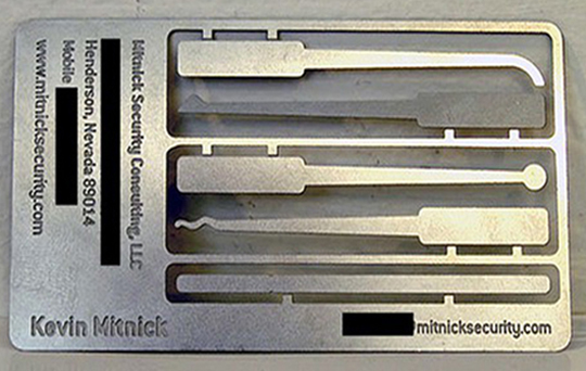
- Also, don’t be afraid to use materials other than paper for your business card, like this metal business card for Sam Buxton
- Play with textures. Making your business card texturized can be interesting. If you’re a person who is in a more conservative and professional business environment, bringing texture to your business card can make it as interesting as unconventionally shaped ones. Examples are these business cards for Jason McGrew and Studioish.
- Logo and Tagline. Business cards are about representation, and a deeply thought out, well constructed logo and tagline can get your message across. Both the logo can help your clients remember you (think the M design for McDonalds – almost anyone in the entire planet knows what company that simple but effective logo stands for). If you can manage to create one that is witty or funny like in this business card for Josh Can Help, that will be great too.
Essentially, what I’m getting at here is the key to a great design is in both form and function. A business card is a representation of you, and your card should be attractive to the eye but functional enough to serve its purpose of letting your client know how to contact you.


Thanks for the mention!