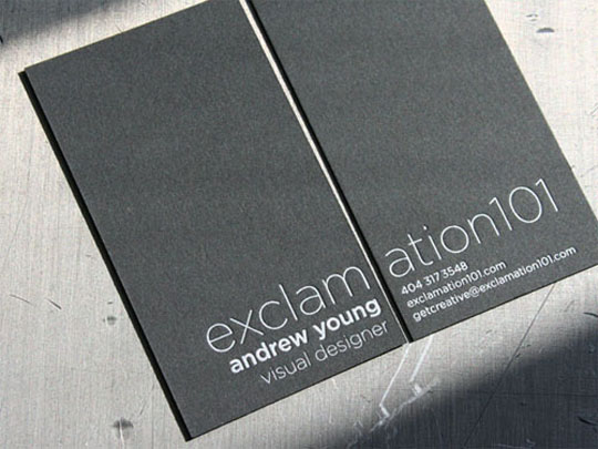
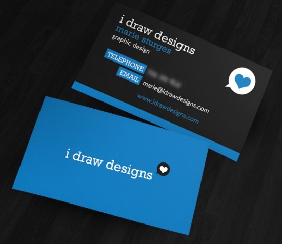
For many, minimalism brings to mind images of all-white designs, empty rooms or designs that hardly consist of anything to the point that people find it pointless or boring. In truth minimalism is much more than that. Minimalism is “designat(ing) anything which is spare or stripped to its essentials.” It is “… subtracting the obvious, and adding the meaningful” as John Maeda puts it.
Minimalism is elegant and also functional. It emphasizes what needs to be focused on and gets rid of the rest. I believe it’s also the secret of some of the most successful brand designs. Take the Macintosh apple design, the Mc’Donalds double-arch design and Nike’s check mark; they’re really simple and easy to recall designs.
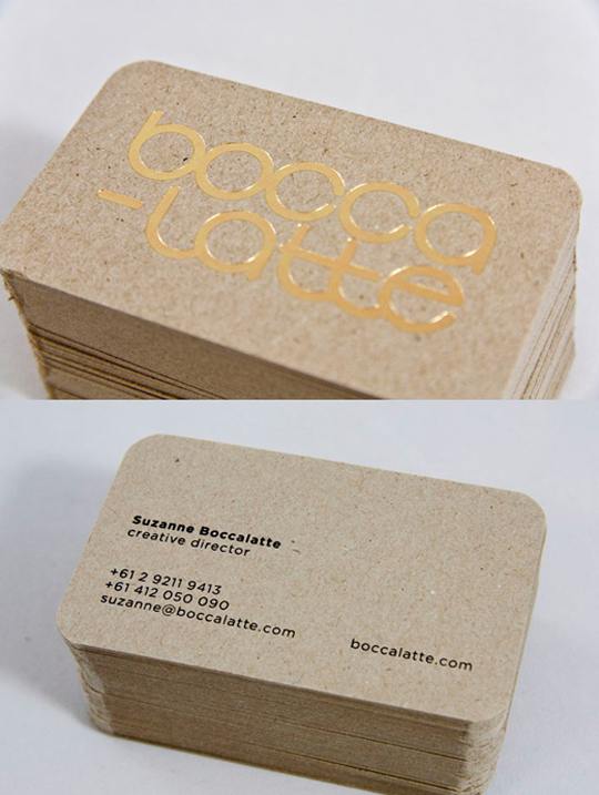
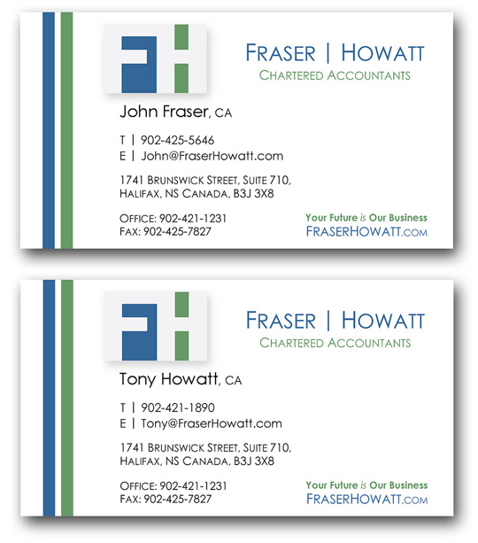
Minimalism, even in business cards has a lot of advantage. A non-cluttered design is not only aesthetically pleasing, it brings clarity and focus to what a business card’s function should be: letting the client know the business name or your name (logo if you have it) and the way by which they can contact you.
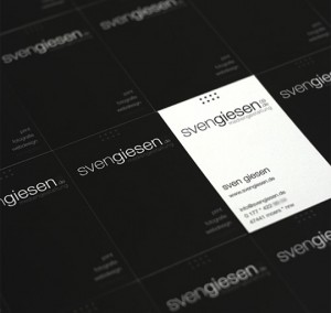
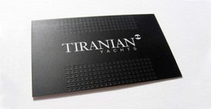
Below are great examples of some really simple minimalist business card designs.
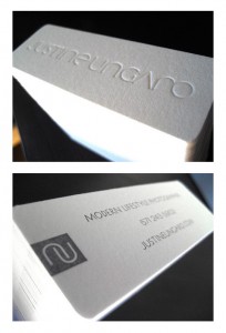
Another elegant, high quality minimalist business card. Most of the time, all you really need is to put the name of your business and your website.
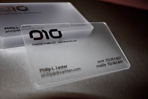
Dream Ten’s Plastic Business Card
Plastic, transparent business cards are one of the ways by which you can make an interesting minimalist business card. Not only that, it’s sturdy too, compared to your regular stock business card which can get torn apart or worn out easily.
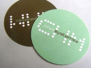
CHM System’s Unique Business Card
Even if you don’t indicate your contact or website, people’s tendency is to search your brand name. That’s what I did when I saw CHM Systems’ business card to learn more about them.
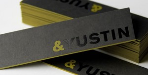
I also searched online for the card ‘&Yustin’ and it turned right up number one in the search engines. The website also matched the brand-name and logo on the business card so you know it’s the company you were looking for.
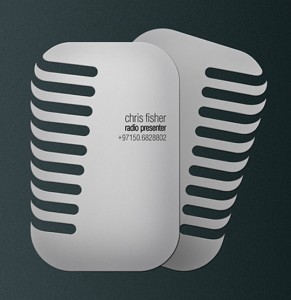
Chris Fisher’s DJ Business Card
Above is of my favourite minimalist business cards of all time. Going for a die-cut business card is great for minimalist without being boring.
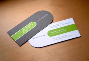
Another nice, minimalist die-cut design.
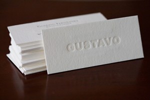
Gustavo Fernandez’ Business Card
The classic minimalist business card is a nice stock paper card with letter pressed bold font.
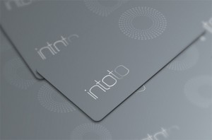
The modern minimalist.
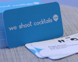
We Shoot Cocktails.com’s Business Card
You can also make your website itself the focus of your business card.
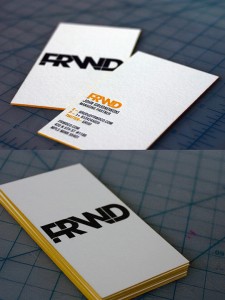
FRWD’s Advertising Business Card
A thick, nicely textured minimalist business card. The logo is letter pressed and the sides are lined with yellow. A lot of subtle elements make it simple but interesting. The strong and commanding bold font makes the logo the focus of the design.
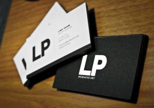
Another great minimalist design with the emphasis on the logo.
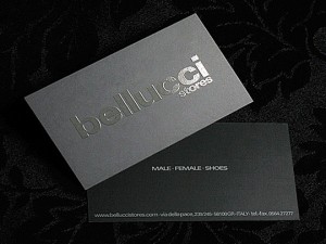
Bellucci Store’s Business Card
This design pretty much hits you on the head for what this company sells.
Simple, functional design.
Patricia Staelen’s Business Card
This card has a dynamic design that is the center of attention.
A simple design that is given a sophisticated attitude by the letter-pressed logo pattern.
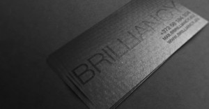
Brilliancy’s Business Card
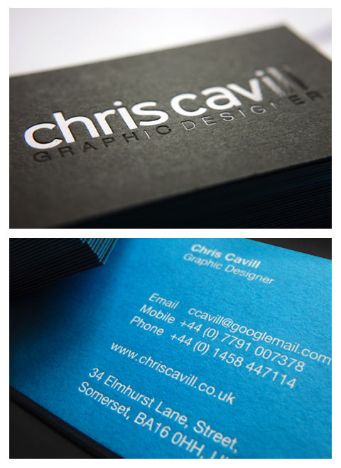
A beautiful coal-black business card with a simple font that is the center of attention of the design.
