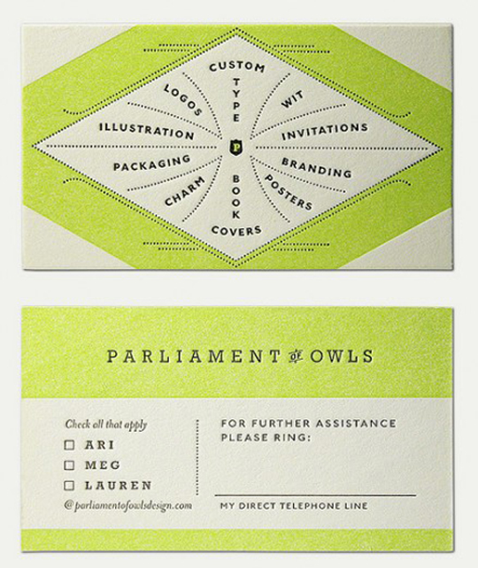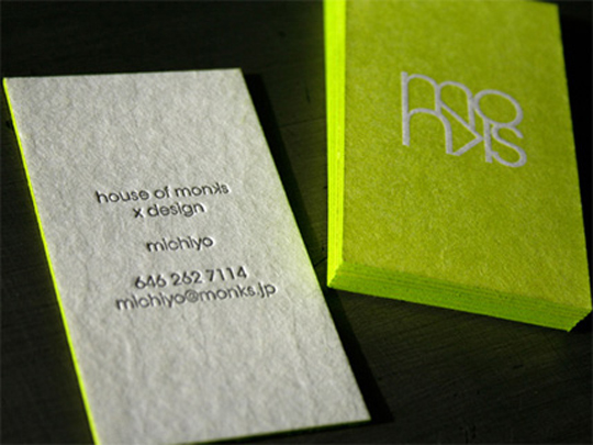
When you are designing a business card, one of your goals is to make it stand out or make it attractive enough to catch people’s eyes.
But what makes a good design?
Oftentimes, the key to a good business card design is the layout.
A good business card layout can make your card stand out as much as a business card that makes use of unconventional materials like wood or metal whereas a bad one can defeat the purpose altogether.For the novice designer, here are a few tips on how you can create a good business card layout.
Avoid cluttering your layout space with too many elements
A cluttered design most of the time results in an eye-sore. If there’s too much going on in a design be unpleasant to look at. What’s worse is that a cluttered design can take attention away from the important details such as the contact information. When you feel that you really have to put a lot of elements in your business card layout, make sure that they at least have continuity, flow and organization.
Note of the amount of color you use on your business card
Colors can be distracting, especially if they are loud and if too many are used. Using three colors maximum would be a good design move for a card, and it’s also good to make use of just one color that stands out to give uniformity to the design.
Another important note with regards to color is putting colored text over a colored background. A colored text over a colored background could result in the text getting washed out if the contrast between hues is too weak, whereas a strong contrast between colors can look jarring – so be careful.
Call attention to just a few elements
Highlighting just one element is good. More than that will make it look cluttered. Make sure the things you call attention to are the important elements like the company name, your preferred contact details or the address.
You can call attention to details by 1) varying the color from the rest of the elements, 2) making the particular element larger in respect to the others, and 3) putting the element in the center with minimized elements in the background.
Make sure all the needed elements are present
Design only comes secondary to substance. The primary importance of a business card is having a display of your name and contact details. Make sure that purpose is served when you are designing your business card.
Lastly, when in doubt it is always wise to go for the minimalist approach. Minimalist business cards are effective in that they are subtle but stylish and pleasing to the eye. To see examples of minimalist business cards, click here.


